
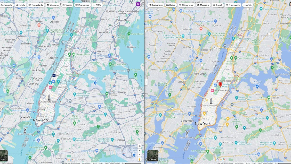
Google quietly released an update to its Google Maps interface that updates the color palette for phone and desktop users: Roads are gray, water is a brighter greenish-blue, and parks are a bluish-green. The tweak seems to be rolling out slowly, and reactions — at least anecdotally — have been mixed.
The palette update is a shift away from Google Maps’ more traditional look and is closer to the hues used by Apple Maps, as pointed out by 9to5Google, which wrote about the UI update earlier and called it a test. Amusingly, this follows Apple finally letting users download maps to use offline, in the iOS 17 software update coming in September, a feature Google Maps has had for years.
Aside from resembling the colors used by Google’s rival in mapping software, the new Google Maps hues aren’t as easily distinguishable as they had been before. Most notably, the tones for water and nature/park areas are close enough to bleed together.
Fortunately for folks who don’t like the new look, Google Maps is relatively unchanged in dark mode.
Google didn’t immediately respond to a request for comment.
Read more: Google Maps Cheat Sheet: The Most Useful Tricks You Need to Know